GMAT Focus Graphics Interpretation Questions – The Ultimate Guide
GMAT Graphics Interpretation (GI) questions appear in the Data Insights section and ask you to read a graph or chart and fill in two blanks. Both blanks must be correct...
GMAT Graphics Interpretation (GI) questions appear in the Data Insights section and ask you to read a graph or chart and fill in two blanks. Both blanks must be correct to earn the point. No partial credit. The key to accuracy is the ATM-CM framework: scan Axes, Trend, Min/Max, Correlation, and Miscellaneous before reading the prompt. This guide covers every graph type, the full ATM-CM approach with worked examples, and the most common mistakes to avoid.
GMAT Graphics Interpretation questions are among the most misunderstood in the Data Insights section. Not because they are inherently difficult, but because most test takers approach them the wrong way. They try to memorise every number on the graph before reading the question, or they get rattled by unfamiliar chart types. Neither is necessary. Crackverbal has helped 50,000+ students since 2006 work through Data Insights, and GI questions consistently reward the same thing: a structured approach applied calmly, not speed or visual memory. For a full picture of how GI fits within the broader DI section, see our GMAT Data Insights guide.
The free Crackverbal GMAT diagnostic gives you a section-wise breakdown in 12 minutes. Know your gaps before you study.
What Are GMAT Graphics Interpretation Questions?
GI questions are one of five types in the Data Insights section. They present a graph or chart and ask you to complete statements using dropdowns.
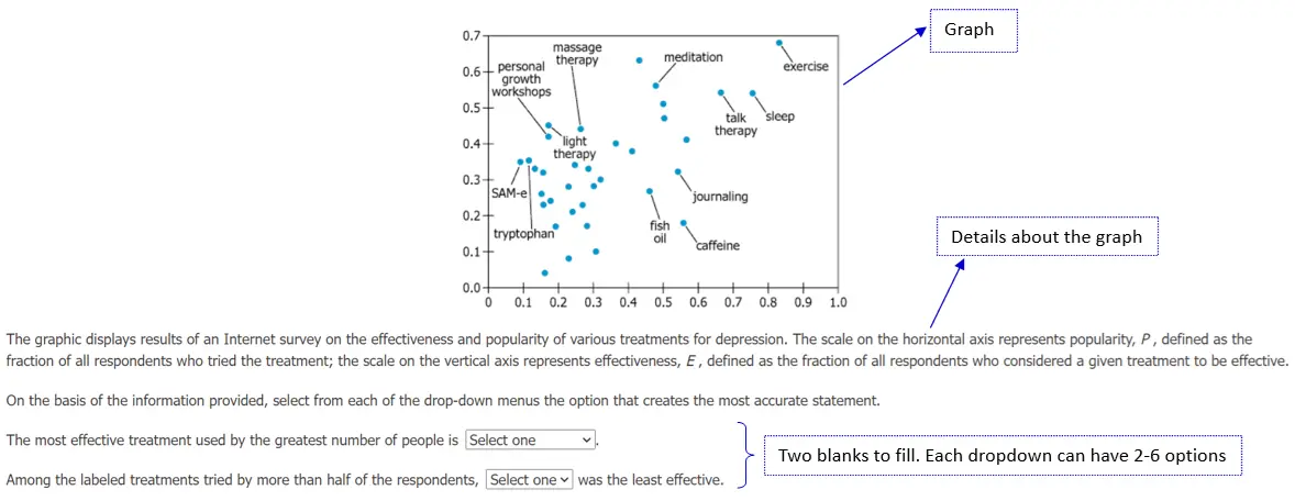
Graphics Interpretation questions present a graph or chart (sometimes two, or a graph paired with a table) along with a brief text description, and ask you to complete one or two statements using dropdown menus. Each dropdown typically has between two and six answer choices.
The move to Data Insights did not change their structure. In DI, GI questions sit alongside Multi-Source Reasoning, Table Analysis, Two-Part Analysis, and Data Sufficiency. For context on how the full section is scored and structured, see our GMAT Focus Edition guide.
The Structure of a GI Question
Every GI question has the same three-part layout presented simultaneously on screen: a graph or multiple graphs (or a graph paired with a table); a text description providing context about the graphs; and either one question statement with two blanks, or two question statements with one blank each.
The critical rule on scoring: both blanks must be correct to earn the point. No partial credit is available. A question where you get the first blank right and the second wrong scores exactly the same as a question you did not attempt. That rule has a clear implication: if you are confident in one blank but uncertain about the other, always attempt the second. Working through both gives you a genuine chance at the full point; skipping the second guarantees zero.
How Many GI Questions Appear on the GMAT?
GI questions make up roughly 10 to 25% of the Data Insights section, which contains 20 questions total — meaning you will typically see two to five GI questions per test. The exact number varies per administration. With no partial credit available, getting both blanks right on every GI question is what separates high scorers: a wrong answer and an unattempted question score identically, so accuracy on each one counts.
Types of Graphs in GMAT GI Questions
The graph types most commonly tested in GMAT GI questions fall into two categories: qualitative and quantitative. The quantitative formats appear more frequently, but you need to be ready for both.
| Category | Graph types tested on GMAT GI questions |
|---|---|
| Qualitative | Venn Diagram, Network Diagram, Tree Diagram, Flowchart, Org Chart |
| Quantitative | Pie Chart, Bar Chart (Grouped, Stacked), Histogram, Line Chart, Scatter Plot (including Bubble Charts), Normal Distribution Graph |
Qualitative Graph Types
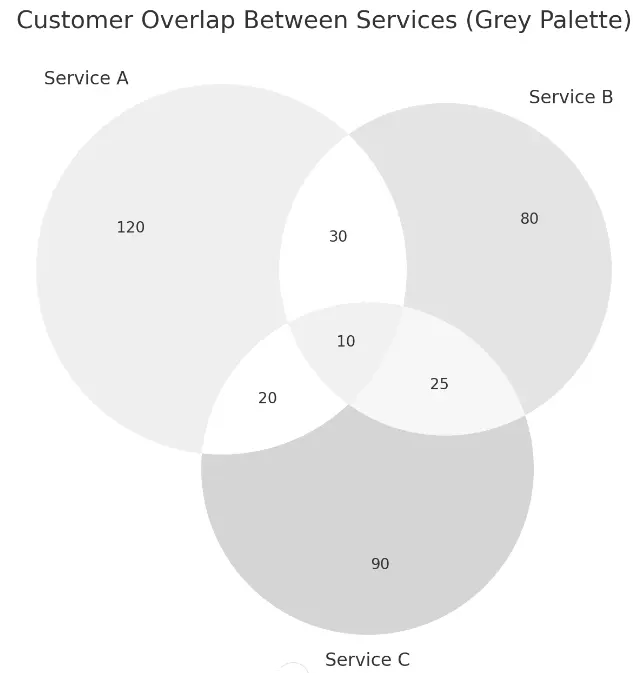
Venn Diagram
Overlapping circles where each circle represents a group and each overlap shows elements common to both groups. Tests your ability to identify intersections and exclusive members.
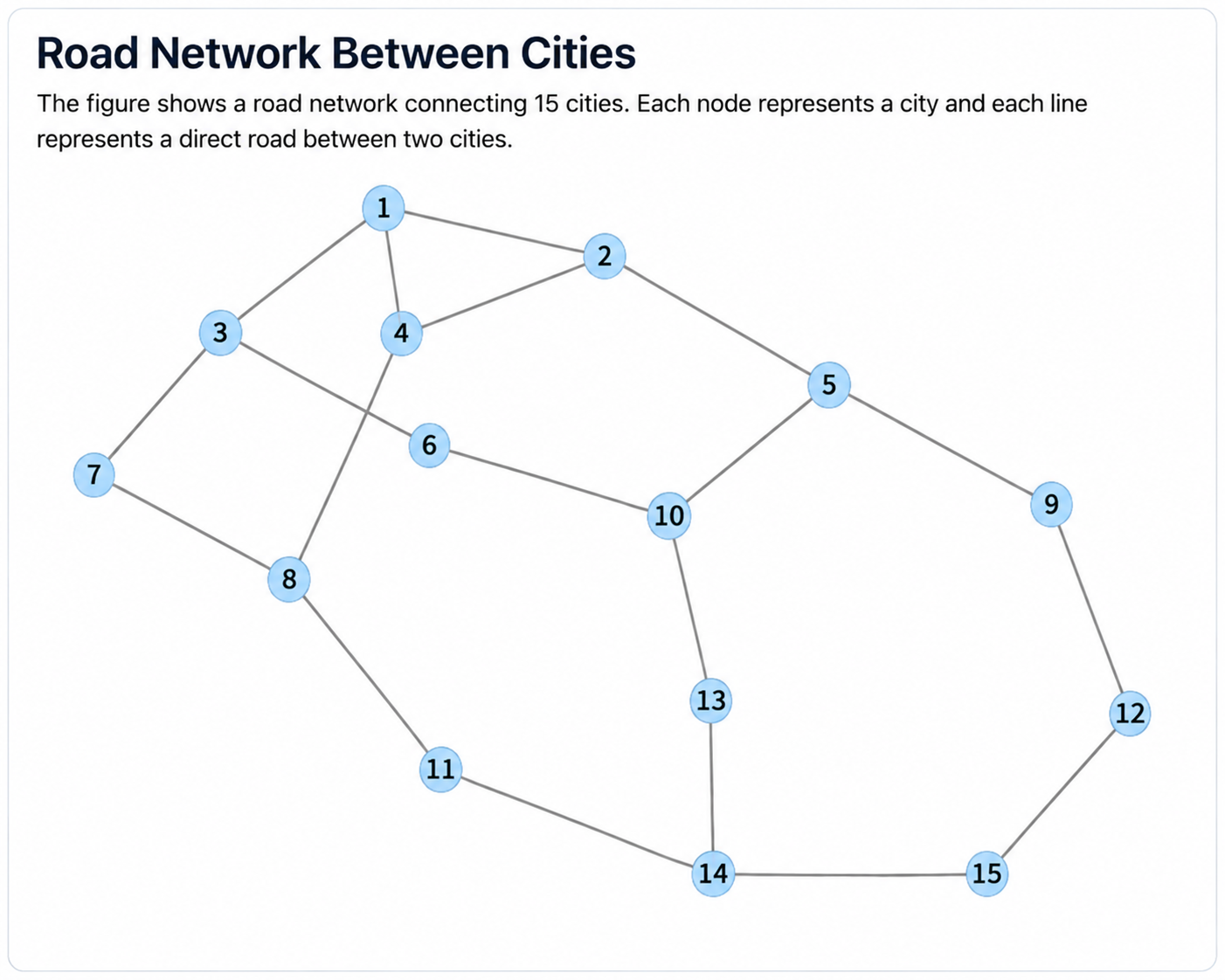
Network Diagram
Nodes connected by edges. Represents relationships between entities, commonly used in logistics, communication, or social network scenarios.
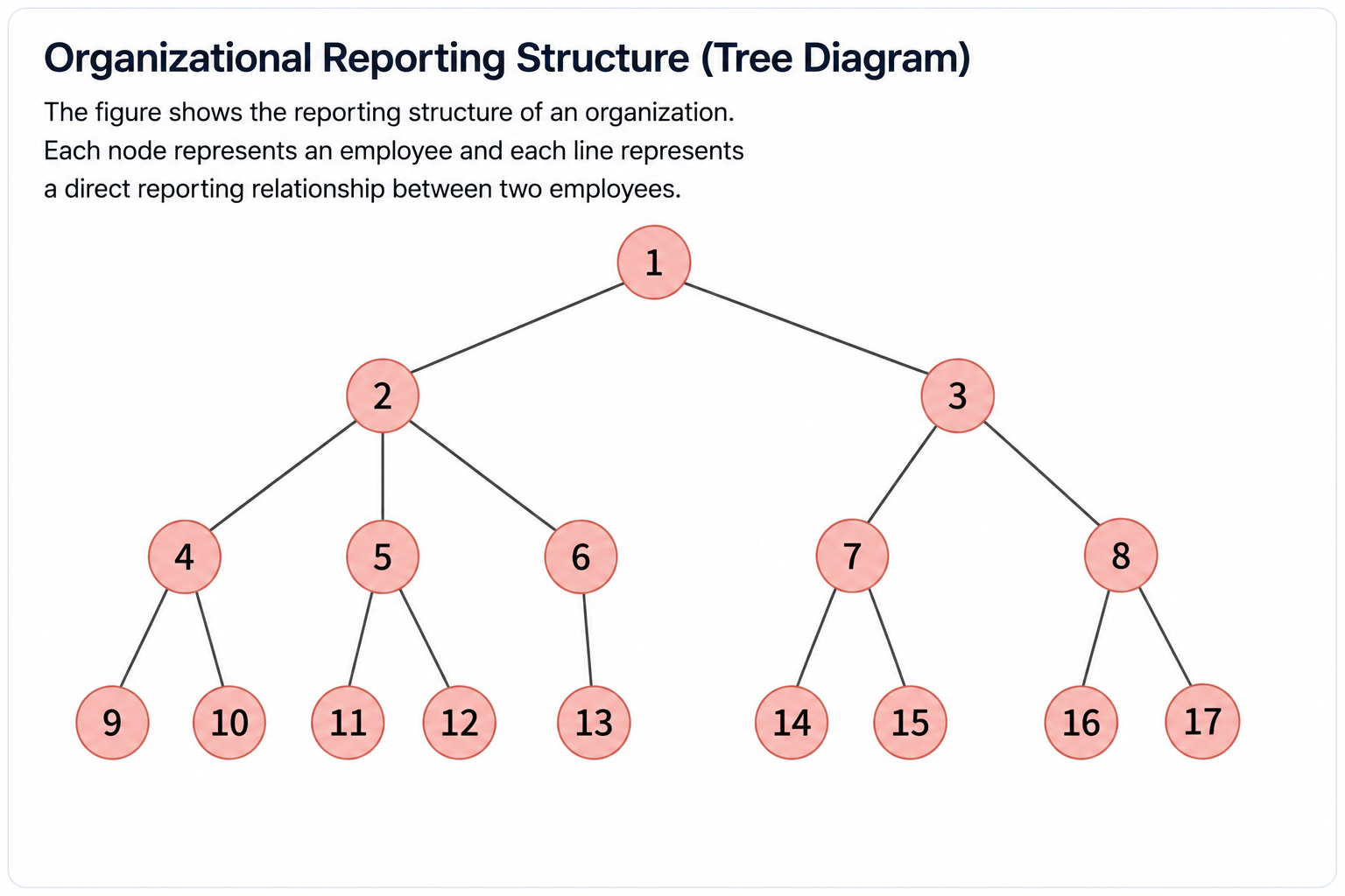
Tree Diagram
Branches from a root node to show hierarchical relationships or sequential outcomes. Common in probability and decision-tree scenarios.
Flowchart
Boxes connected by arrows to represent a process. Each step has a defined outcome or decision point. Tests your ability to trace a path through a process.

Org Chart
A hierarchical diagram showing relationships between roles, departments, or entities within a structure. Tests your ability to read reporting lines and identify levels within the hierarchy.
Quantitative Graph Types
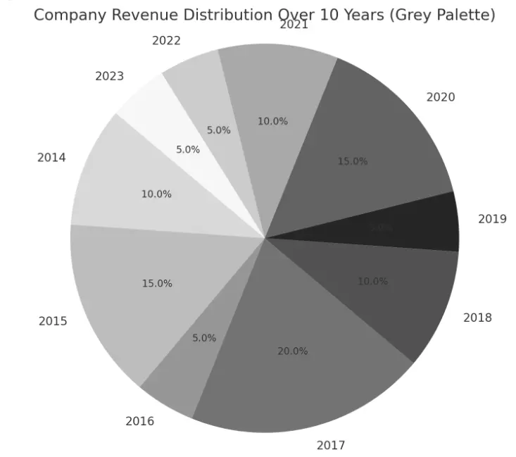
Pie Chart
A circular chart divided into sectors proportional to each category’s share of the whole. Tests proportion and percentage interpretation.
Bar Chart (Grouped / Stacked)
Bars whose height or length represents a value. Grouped bars compare categories side by side. Stacked bars show part-to-whole relationships within each category.
Histogram
Bars showing the frequency of data points within ranges (bins). Similar to a bar chart but used exclusively for continuous numerical data. Interval width matters.
Line Graph
A continuous line connecting data points on a coordinate plane. Used to show trends over time. Pay attention to the slope and direction of the line between points.
Scatter Plot
Points plotted on a coordinate plane showing the relationship between two variables. Correlation questions (positive, negative, or negligible) almost always come from scatter plots.
Crackverbal’s GMAT preparation covers all five DI question types systematically, not as isolated drills. See how we approach the full section.
Essential Skills for GMAT GI Questions
Three distinct skill sets determine your accuracy. Most preparation mistakes come from over-investing in one and neglecting the others.
Analytical Skills: Reading and Interpreting Data
The core analytical task is extracting the right insight from a visual without getting distracted by irrelevant data. This means identifying trends and patterns, understanding what the graph is measuring, and noting them all down. A common trap: assuming you need to understand everything on the graph before you can answer. The GMAT rewards targeted comprehension, not memorisation.
Mathematical Skills: Calculations from Visual Data
GI questions regularly require percentage calculations, ratio comparisons, and trend analysis based on visual data. Exact values are often difficult to read from a graph. The GMAT knows this. Most numerical questions ask for an approximate value (“closest to”) or a relative comparison (“greater than,” “less than”). Understanding scales and units is critical: a y-axis that goes from 0 to 1,000 in intervals of 200 requires a different reading precision than one that goes from 980 to 1,000 in intervals of 5. Practice reading axes carefully before attempting calculations.
Attention to Detail: Noticing What Others Miss
GI questions often include a detail that changes the entire interpretation: a secondary y-axis, a break in the scale, a note that values are in thousands rather than units, or a particular constraint that’s mentioned in the prompt. Before reading the question, spend 10 to 15 seconds scanning the graph for: axis labels, units, scale intervals, and any footnotes or qualifications. This scan takes almost no time but catches the majority of costly reading errors.
How to Read Any GI Graph: The ATM-CM Framework
Most students open a GI question and immediately read the prompt. That is the mistake. Here is what to do instead: a structured 4-step process that starts before you read a single word.
Step 1 is the most important. Before reading the prompt, scan the graph completely using the ATM-CM framework. ATM-CM stands for Axes, Trend, Min/Max, Correlation, and Miscellaneous. Most graphs have at least five layers of information. Your job is to extract all five before moving anywhere else.
Look at both axes. Check the scale, the units, whether the scale is linear or compressed. If the graph has no traditional axes (a network diagram, an org chart, a flowchart), identify the decision-making nodal point instead. That is your equivalent of the axis.
Are the data points mostly increasing? Mostly decreasing? Flat? You do not need every point to confirm a trend. You need the majority. A bar chart ranking five companies by profit has a trend. Notice if that trend is increasing or decreasing across the majority of companies — that is your trend.
Which data point is the highest? Which is the lowest? These extremes show up in questions constantly. Identify them during the scan so you are not searching for them under time pressure when the question asks.
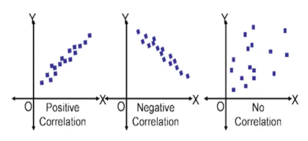
Call the two numerical quantities x and y. As x increases, does y also increase? Or as x decreases, does y also decrease? If the majority of data points move in the same direction, that is a positive correlation. If one quantity increases while the other decreases across the majority of data points — a consistent inverse movement — that is a negative correlation.
The GMAT tests a critical distinction here: correlation is not the same as proportionality. Correlation tells you the direction of movement. Proportionality tells you the ratio stays constant. See the example below.
Footnotes. A second y-axis. A break in the scale. Anything the test maker tucked into a corner. And sometimes just a gut feeling that something about the graph looks unusual — follow that instinct; it is often pointing at the detail that matters. Not every graph will yield all five layers cleanly. That is fine. The framework trains your eyes to look with focused, deliberate attention rather than scattered scanning.
The GMAT tests this distinction directly. A question will use the word “proportional” when students assume it just means correlated. Catching that difference is worth marks.
As x increases, if y also increases across the majority of data points: positively correlated. If the ratio y/x stays constant throughout: also directly proportional. Change one value so the ratio shifts, and the correlation survives but direct proportionality is gone.
| x | 2 | 3 | 4 | 5 | 6 |
|---|---|---|---|---|---|
| y | 4 | 6 | 8 | 10 | 12 |
| y/x | 2 | 2 | 2 | 2 | 2 |
| x | 2 | 3 | 4 | 5 | 6 |
|---|---|---|---|---|---|
| y | 4 | 6 | 8 | 10 | 14 |
| y/x | 2 | 2 | 2 | 2 | 2.33 |
Both tables show x and y moving in the same direction across all five points: positively correlated. In the second table, the ratio y/x at the last pair is 14/6, which is not 2. The direct proportionality is gone even though correlation remains.
Now change three of the five pairs so y decreases while x increases. Three points go one way, three go the other. The majority rule breaks. No correlation at all. The graph has the same axes and similar numbers, but a completely different interpretation.
Now read the prompt. Sometimes it confirms what you already saw. Sometimes it gives you information the graph alone could not provide: total counts, definitions, or contextual constraints. Either way, you are reading it on your terms. You are checking, not discovering.
Look at the question, identify the keywords, and understand the context before solving. Read each statement deliberately rather than skimming. Some GI questions have two blanks in a single sentence where the answer to the second depends on the first — taking an extra few seconds here is all it takes to catch those dependencies before they cost you a point.
The graph has the answer. Check the dropdown options before you calculate anything. Many GI blanks have options spread far enough apart that a rough estimate is sufficient to eliminate three of four choices. The options tell you how precise your reading needs to be. Sometimes you can also use the options as an anchor: on questions where one blank bears a relationship to the other, checking whether your two answers are internally consistent is a quick way to catch an error before you move on.
Check the dropdown options before you calculate anything. Many GI blanks have options spread far enough apart: “10%,” “25%,” “50%,” “75%.” A rough estimate is sufficient to eliminate three of four choices. Looking at the options first tells you how precise your reading needs to be.
Worked Example: Applying the ATM-CM Approach
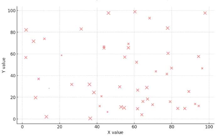
Here is how the approach works on a real GI question using a scatter plot of 22 skyscraper buildings.
The example uses a scatter plot where each of 22 buildings has two data points: number of floors (red dot, left y-axis) and mean height per floor in metres (black dot, right y-axis). The x-axis shows roof height in metres, ranging from roughly 350 to 510 metres.
Step 1: ATM-CM scan. Axes: left y-axis = number of floors; right y-axis = mean height per floor (metres); x-axis = roof height (metres). Trend: as roof height increases, red dots tend higher and black dots tend lower. Min/Max: highest black dot is upper left; highest red dots are on the right. Correlation: red and black dots move in opposite directions as x increases — an inverse relationship. Miscellaneous: two y-axes and two distinct dot types; 22 buildings means 22 red and 22 black dots.
Step 2: Read the blanks. Blank 1: Which building has the greatest mean height per floor, and what is its approximate roof height? Blank 2: What is the correlation between number of floors and mean height per floor?
Step 3: Read deliberately. Blank 2 asks for correlation between floors and mean height, not between roof height and either of those. Make sure you are reading the right pairing.
Step 4: Solve. Blank 1: Mean height per floor is the black dot. The highest black dot sits near the upper left, corresponding to a roof height of approximately 365 metres. Blank 2: Buildings with higher roof heights have more floors (red high) and lower mean floor height (black low). Buildings with lower roof heights have fewer floors and higher mean floor height. Consistent inverse relationship across the majority of points: strong negative correlation.
Prepathon is a free Data Insights practice tool built for the GMAT Focus Edition. GI and DS questions with instant step-by-step explanations — no sign-up needed.
Common Mistakes in GMAT GI Questions
GI errors fall into three consistent categories. Knowing which type you are prone to makes practice more efficient.
Misreading the Graph
The most damaging errors come from misreading before the analysis even starts: wrong axis, wrong units, wrong data series assignment. The fix is procedural: always confirm what each axis measures and what each data series represents before reading any values. If there is a secondary y-axis, establish which data series corresponds to which axis before doing anything else.
Process of elimination helps here too. Before solving, look at the dropdown options. If one blank is asking for a value and the options are spread across a wide range, a rough reading is usually sufficient. Knowing the options in advance prevents you from spending time on precision calculations the question does not require.
Overlooking Key Data Points
Many test takers read the graph they expect to see rather than the graph in front of them. This produces errors when the graph includes an unusual data point, a break in scale, a note that values are presented as percentages rather than absolutes, or a particular constraint that’s mentioned in the prompt. Active reading — checking axis labels, scale intervals, units, and any text annotations before answering — is the habit that prevents this.
When two graphs or a graph-and-table combination are presented, check what connects them. The link is always stated in the text. Missing it means answering each question in isolation when the question is actually asking about a relationship between the two displays.
Time Pressure Errors
The GMAT Data Insights section gives you 45 minutes for 20 questions, an average of about 2 minutes 15 seconds per question. GI questions involve more visual processing than other DI types, which makes them feel slower. Two habits reduce time pressure: previewing the dropdown options before analysing the graph (often eliminates the need for precise calculation), and flagging a question that is consuming too much time and returning to it at the end if time allows.
Practising GI questions under timed conditions is the only reliable way to build the reading fluency the format requires. Prepathon is a free Data Insights practice tool where you can drill GI and other DI question types under timed conditions with instant feedback. For broader study planning, see our guide on GMAT practice tests.
GI Is Training Your Attention, Not Your Answers
Here is what most students miss about ATM-CM. It was never about the five letters. It was about a habit almost no one arrives with: breaking something complex into pieces before reacting to it.
So when a graph does not fit the checklist — a pictogram, a hybrid chart, something you have never seen — you are not back at zero. Your eye has already been trained to do the thing that matters. It scans for what is being measured. It looks for a direction, an outlier, a relationship. It asks what the graphic is trying to say before it asks what number it is hiding. That instinct does not switch off because the shape in front of you is unfamiliar.
This is the difference between a student who has memorised a framework and one who has built a skill. The first freezes when the graph looks strange. The second looks harder, because looking harder is now automatic. Every hour spent practising GI is not just preparation for the graphs that follow the pattern. It is training your eye to see structure before noise.
See the structure first. The numbers follow. Carry this back with you:
- Graphics Interpretation was never a maths section wearing a graph. It is an attention section, and the maths is the easy part.
- Every graph is encoding one of four things: proportion, correlation, association, distribution. Name the relationship. That is the actual question.
- A framework is not something you memorise. It is something you use until your eyes do it without being asked.
- That habit does not stay behind on the graphs it was built for. It travels with you.
- When a graph resists the checklist, do not go looking for which letter applies. Trust what your eye has already noticed. It has noticed more than you think.
I will say this plainly, because it is worth saying plainly: the score is not the target. It is the receipt. Once your eye is trained to catch what most people scan past — an outlier, a scale that quietly shifted, a relationship sitting under the numbers — high GI accuracy is not something you chase. It is what is left over once the noticing is real. Train the eye. The score will follow.
Recommended Resources for GMAT GI Practice
Official GMAC material is the gold standard. Unofficial questions often miss the nuance of how the GMAT presents data and structures dropdown choices.
- GMAT Official Guide 2026–2027 (eBook + Online Question Bank) — The primary resource for official practice questions. The online question bank allows filtering by question type, including Data Insights.
- GMAT Official Guide: Data Insights Review 2026–2027 — A focused collection of DI questions including GI. Use once you have exhausted the main guide’s DI questions.
- GMAT Focus Official Practice Questions: Data Insights — Standalone DI question sets for targeted section practice.
- GMAT Official Starter Kit + Practice Exams 1 and 2 — Two free full-length adaptive tests. Treat each as a timed test day, not casual practice.
- GMAT Official Practice Exams 3–6 — Four additional full-length tests for later-stage simulation.
- GMAT Club: Data Insights forum — Community-sourced questions with expert explanations. Useful for high-difficulty practice when official material is exhausted.
- Prepathon (Free Data Insights Practice Tool) — A free practice tool covering all five Data Insights question types including GI. Instant explanations, section-wise accuracy tracking, no sign-up needed. Good supplement to official GMAC material.
- Crackverbal GMAT programmes: GMAT online coaching, GMAT Personal Tutoring, and GMAT Fast Track all cover Data Insights systematically, with GI worked examples and timed practice integrated into the curriculum.
For broader GMAT study material guidance beyond DI, see our GMAT study material guide.
Crackverbal’s GMAT preparation integrates all five DI question types (GI, MSR, TA, TPA, and DS) alongside Quant and Verbal into one structured curriculum. Start with a diagnostic to see where you currently stand.
Still have questions?
GI Is a Process Test, Not a Knowledge Test
The test takers who lose marks on GI almost always do so at the reading stage, not the analysis stage. They skip the ATM-CM scan, misread an axis, miss a secondary y-axis, or overlook a unit qualifier. The ATM-CM approach in this guide addresses each of those failure points directly.
The path from here is practice with official GMAC material, under timed conditions, reviewing every error against the three categories: misread (process error), overlooked detail (attention error), or time pressure (pacing error). Each category has a different fix, and identifying which one is causing your errors is more useful than simply doing more questions.
If you want a structured curriculum that covers all five DI question types (not just GI) alongside Quant and Verbal, our GMAT online coaching builds Data Insights into the full preparation rather than treating it as a separate module to bolt on at the end.
ATM-CM before you read the prompt. Options before you calculate. Both blanks before you move on. Three habits, applied consistently, cover the vast majority of GI errors.

Your 705+ score starts with
one expert call.
30-minute strategy session. We'll audit your prep, find your gaps, and build a roadmap to your target score.